

Creative Chips Packaging Design – Concept, Process & Design Approach

Project Overview
This chips packaging design project was created to develop a bold, engaging, and market-ready snack brand with strong shelf impact. The main objective was to design a visually appealing chips bag that communicates flavor, quality, and fun at first glance while maintaining a consistent brand identity across multiple variants.
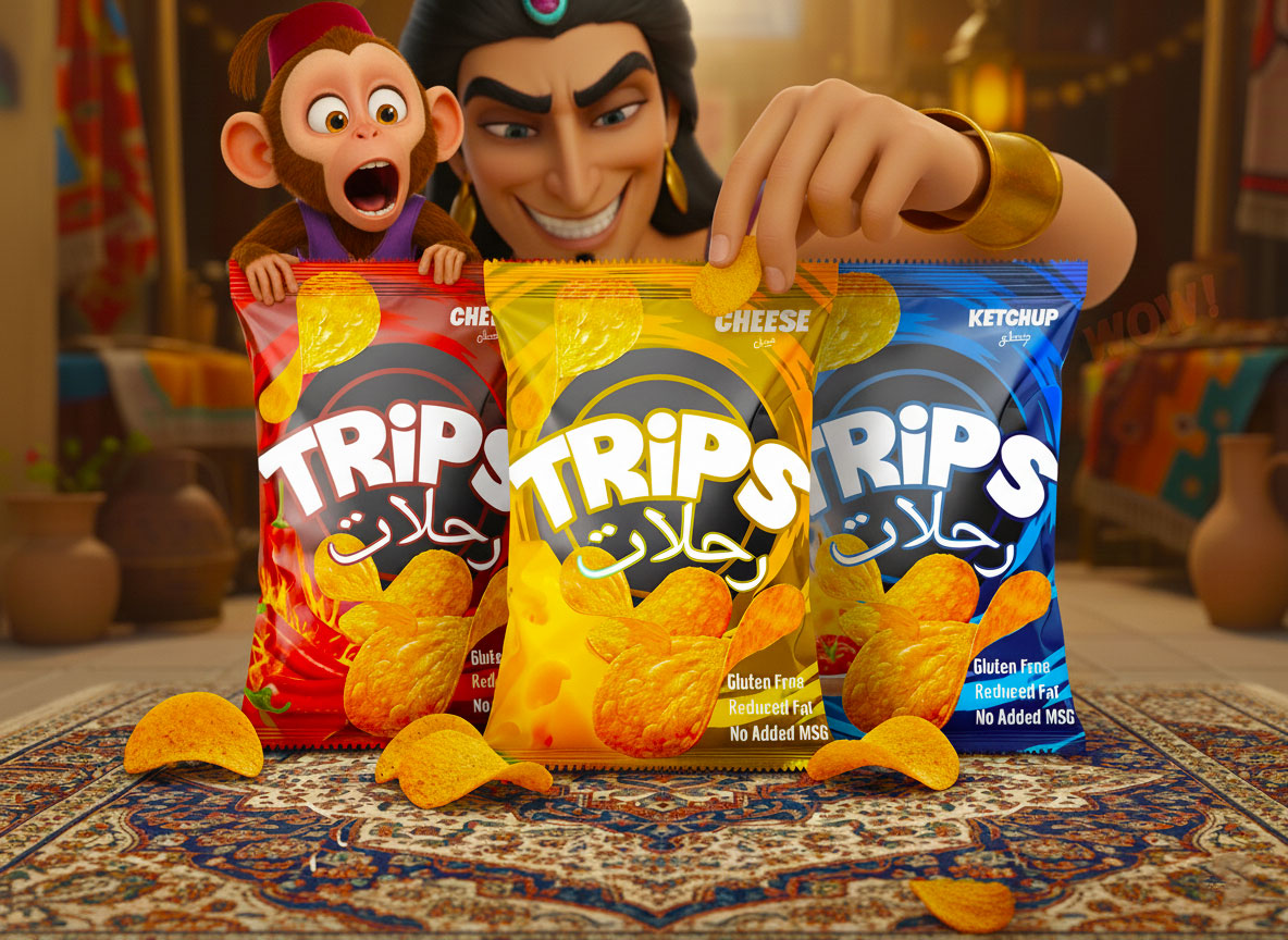
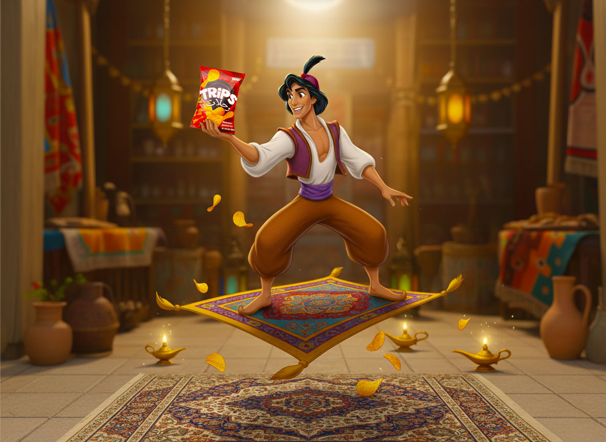
The final output focuses entirely on the chips pouch packaging, including color strategy, typography, layout, and flavor differentiation. The character used in the presentation visuals is included only for mockup and storytelling purposes and is not part of the core branding system.
Design Objective
The primary goal of this packaging design was to:
Create instant shelf visibility in a competitive snack market
Clearly differentiate flavors using color and layout
Build a playful yet professional brand image
Enhance appetite appeal through strong food visuals
Ensure consistency across all flavor variants
The design was developed to work across retail shelves, online stores, and promotional materials.

Concept & Creative Idea
The concept behind this chips packaging is “fun, flavor, and instant recognition.” Snacks are impulse-driven products, so the design needed to feel energetic and exciting while remaining easy to understand.
Bold colors were selected to represent different flavors, helping consumers quickly identify their choice. The playful visual direction adds personality to the brand, making it more approachable and memorable without overwhelming the product information.
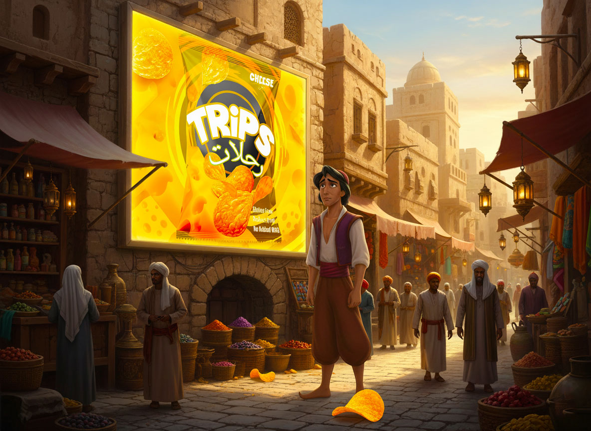
Flavor-Based Color Strategy
Color plays a major role in this chips packaging design. Each flavor is assigned a unique color palette:
Red for bold and spicy flavors
Yellow for cheesy and classic tastes
Blue for tangy or ketchup-style flavors
This strategy improves shelf navigation and strengthens brand consistency across the product line. Despite the variation, all bags share the same visual structure to maintain a unified identity.
Typography & Brand Visibility
Typography was carefully chosen to ensure strong brand presence. The logo is positioned prominently to maximize recognition from a distance. Supporting text is kept clean, bold, and readable, ensuring the packaging remains visually balanced and easy to scan.
The typographic hierarchy guides the viewer naturally—from brand name to flavor, and then to supporting product details—without cluttering the layout.
Packaging Layout & Visual Hierarchy
The chips bag layout is designed with a clear visual flow:
Brand logo at the top for instant recognition
Flavor name and color cues for quick identification
High-quality chip imagery to enhance appetite appeal
Supporting information placed cleanly without distraction
This structured approach ensures the packaging works effectively both in physical retail environments and digital displays.
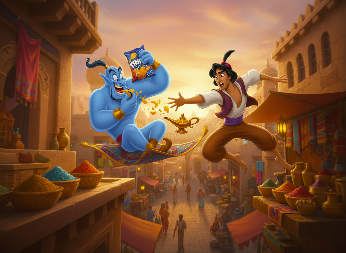
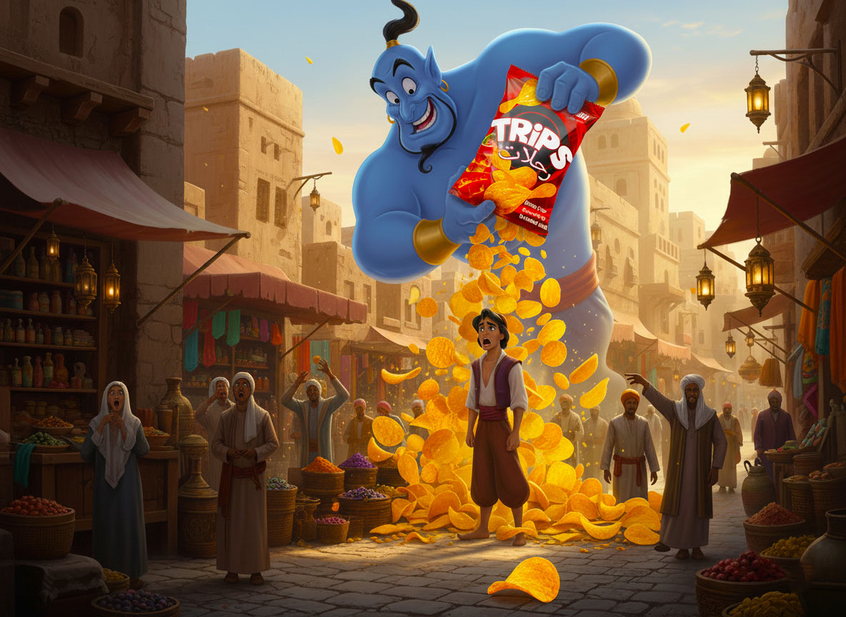
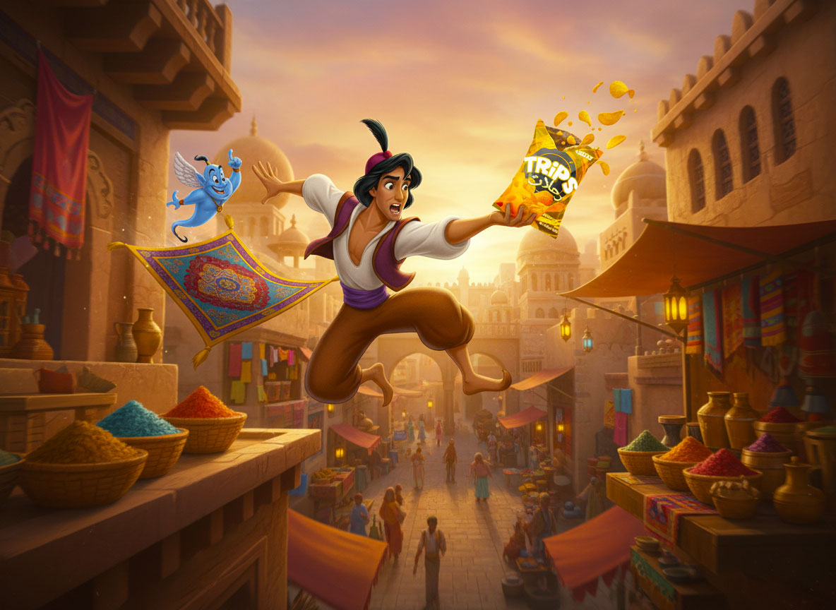
Use of Characters in Mockup Presentation
To enhance presentation and storytelling, a character inspired by Aladdin is used only in the mockup visuals. This element helps demonstrate how the packaging can be featured in engaging marketing scenes.
It is important to clarify that the character is not part of the actual packaging branding. The strength of the design lies in the chips bag itself—its colors, layout, typography, and overall branding system—which can easily adapt to different marketing themes or campaigns.
Designer’s Approach & Thought Process
As a packaging and product designer, the approach for this project was both creative and strategic. The focus was on designing packaging that:
Stands out instantly
Communicates flavor clearly
Feels fun and modern
Remains flexible for future brand extensions
Every design decision was made with real-world retail performance in mind, ensuring the packaging is not only visually appealing but also commercially effective.
Final Outcome
The final chips packaging design delivers a strong balance of creativity and functionality. It successfully combines bold branding, flavor clarity, and playful visuals into a cohesive packaging system that can compete in modern snack markets.
This project reflects a customized packaging solution designed to elevate a chips brand, improve shelf visibility, and create a lasting impression on consumers.