Hulk Smash Energy Drink Can Design
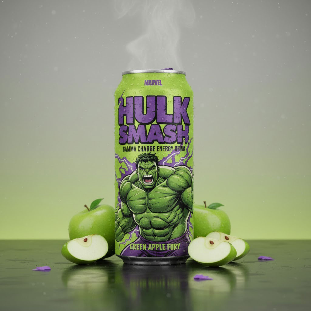
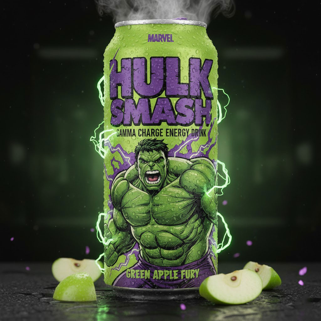
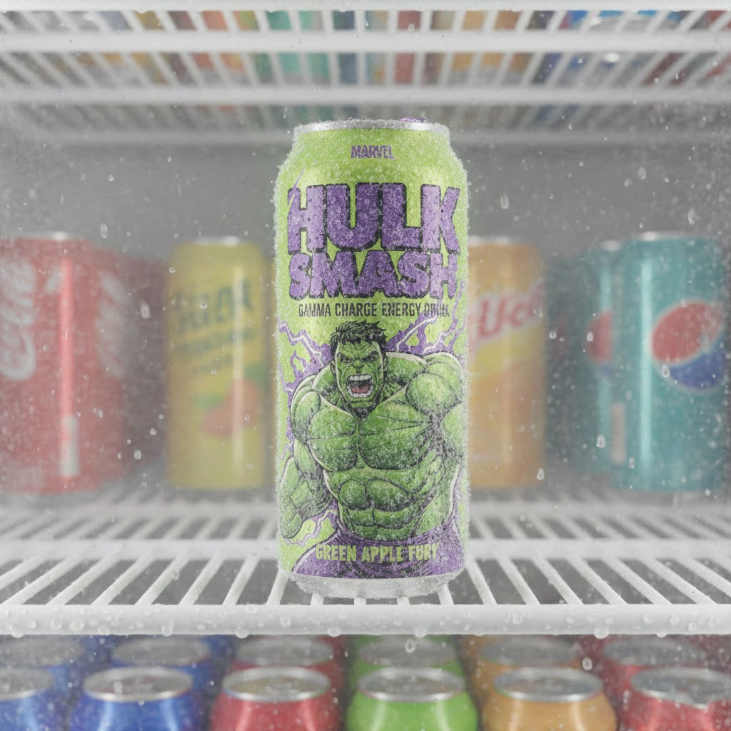
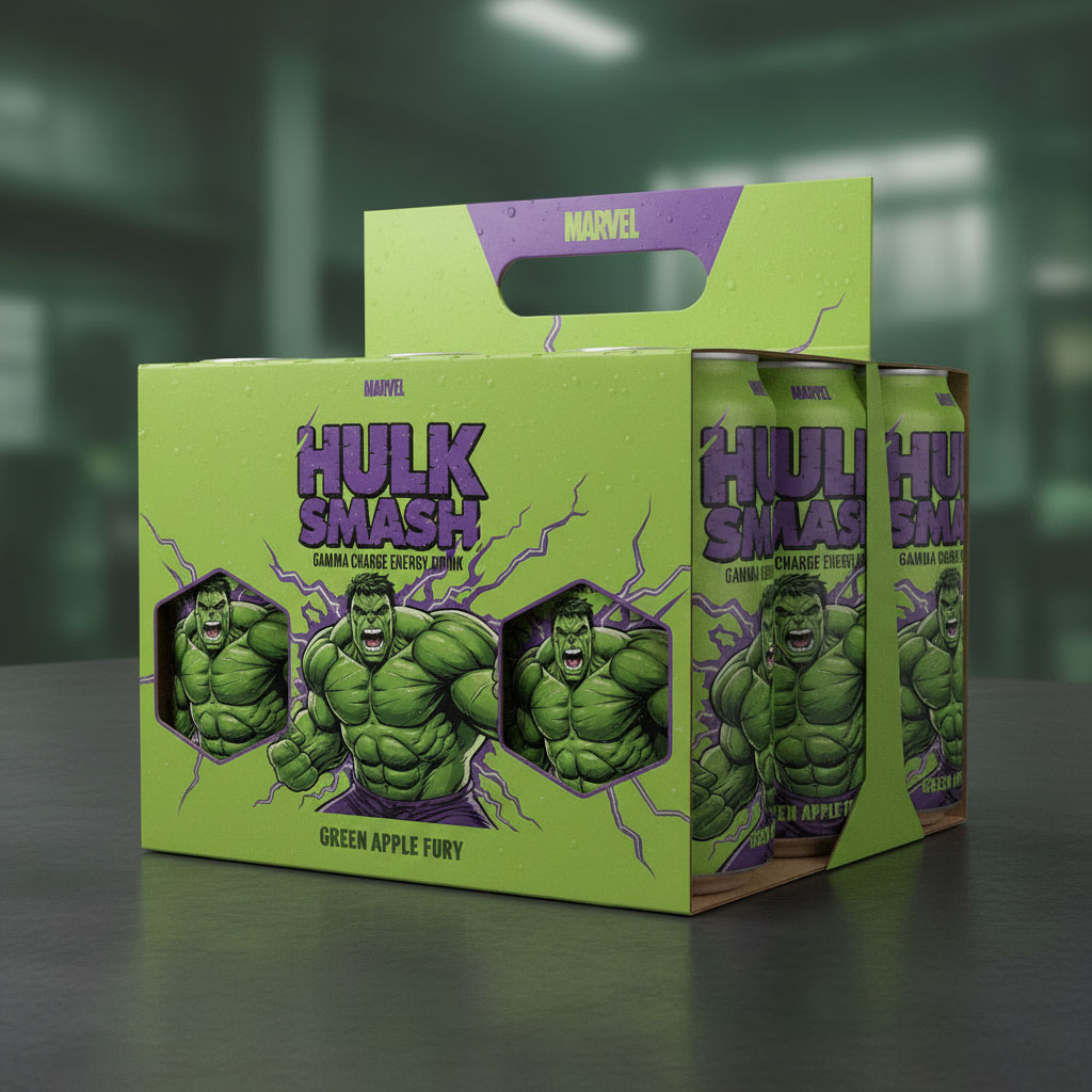
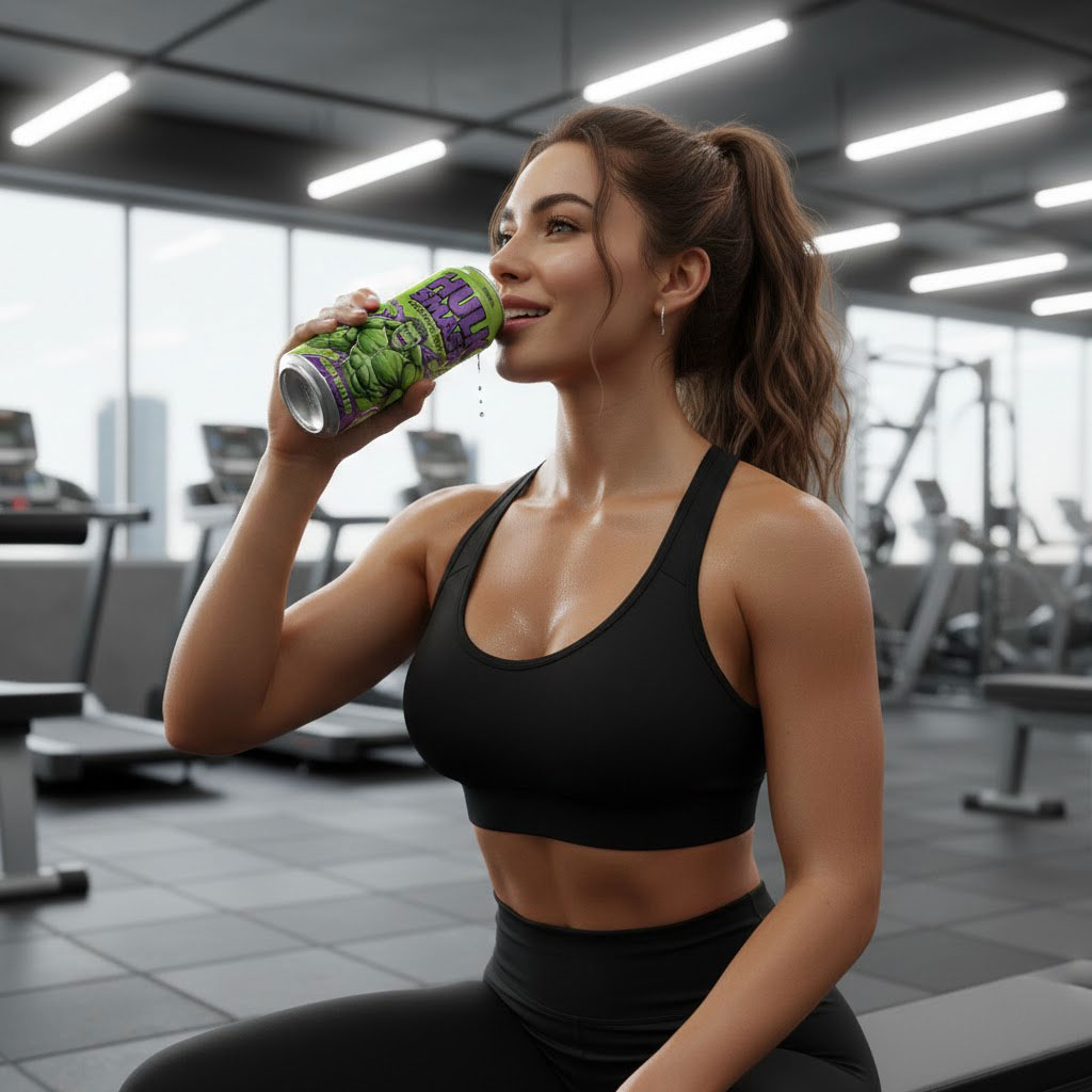
This Hulk Smash energy drink can design was created to deliver maximum shelf impact through powerful visuals, bold typography, and a high-energy color palette. Inspired by superhero strength and intensity, the design captures the raw power and excitement expected from a performance-focused energy drink.
The aluminum can features a vibrant green base color, instantly associated with energy, strength, and freshness. Contrasting purple typography and lightning elements add depth and aggression, reinforcing the product’s “Gamma Charge” energy concept. The illustrated character dominates the layout, creating a strong emotional connection with consumers who associate bold visuals with high performance and adrenaline.
Typography plays a crucial role in this design. The large, distressed lettering ensures excellent readability from a distance, making the product stand out on crowded retail shelves. The flavor name, Green Apple Fury, is positioned clearly at the bottom of the can, maintaining a clean visual hierarchy while supporting quick product recognition.
This project highlights my expertise in custom can packaging design, beverage label design, and branding for energy drinks. Every element—from illustration placement to color contrast—was carefully crafted to balance creativity with commercial appeal. The design is optimized for aluminum can printing, ensuring clarity, durability, and premium finish in real-world production.
As a professional packaging and label designer, I focus on creating designs that not only look visually striking but also support brand storytelling and market positioning. This can design demonstrates how creative illustration, strong branding, and strategic layout can elevate a beverage product and enhance its shelf presence.
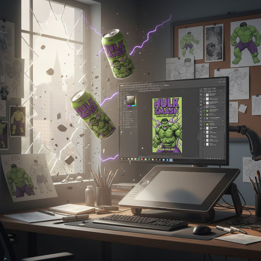
Hulk Smash Energy Drink Can Design – Concept, Idea & Designer’s Approach
This Hulk Smash energy drink can design was developed with a clear focus on power, intensity, and instant shelf visibility. The goal was to create a bold beverage packaging design that visually communicates strength, energy, and adrenaline—qualities that energy drink consumers strongly associate with performance and impact.
Design Concept & Creative Idea
The core idea behind this can design was to translate raw power into visual form. A superhero-inspired illustration was chosen to instantly evoke strength, dominance, and high energy. The aggressive pose and expressive facial details reinforce the concept of explosive energy, aligning perfectly with the product’s “Gamma Charge” theme.
A vibrant green color palette was selected as the foundation of the design, symbolizing power, freshness, and intensity. Purple accents and lightning effects were introduced to create contrast and enhance the dynamic feel of the layout. These elements work together to deliver a high-impact, action-driven visual experience.
Designer’s Approach
As a packaging and label designer, my approach focused on balancing illustration with branding clarity. The character artwork was intentionally made the hero element, while the typography was kept bold and readable to ensure strong brand recall from a distance. The distressed, heavy lettering style reflects toughness and complements the energetic nature of the product.
Special attention was given to visual hierarchy. The product name and energy claim are placed prominently for quick recognition, while the flavor name, Green Apple Fury, is positioned clearly at the base of the can for easy identification. This structure ensures the design remains effective in fast-paced retail environments.
The design was also created with real-world aluminum can printing in mind. Color contrast, line thickness, and spacing were carefully optimized to maintain clarity and vibrancy after printing, ensuring a premium and professional finish.
Packaging Design Outcome
This project showcases my expertise in custom can packaging design, energy drink branding, and beverage label design. The final result is a visually striking can that commands attention, communicates product benefits instantly, and strengthens brand identity through storytelling and illustration.
At RoyaleWraps, my focus is on crafting packaging designs that combine creativity with strategy—helping brands stand out, connect with their audience, and perform better on the shelf.
